SaaS · HR · Customer Edu · Product Marketing
This was a two part contract role where 1) I streamlined the integration of Candu.ai with Workstream's design system, enhancing customer education guides, and 2) I revamped the homepage design, focusing on user experience and product feature visibility to drive higher conversions and improve product marketing efforts. My work aimed to create cohesive, reusable components, ensuring smoother onboarding processes and improved engagement for both new and existing users.
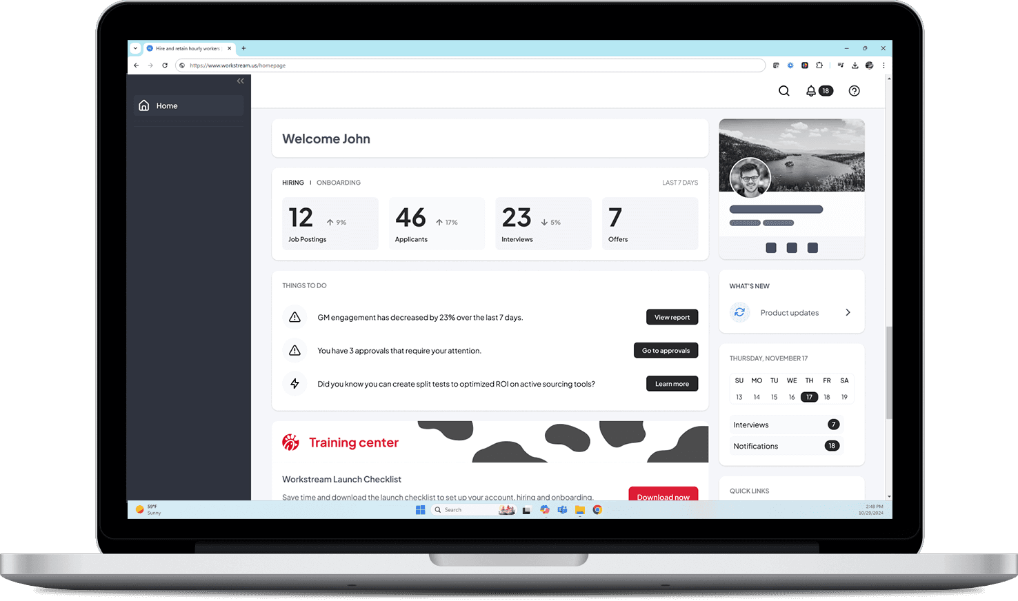
Revamped homepage with quick access links to product marketing
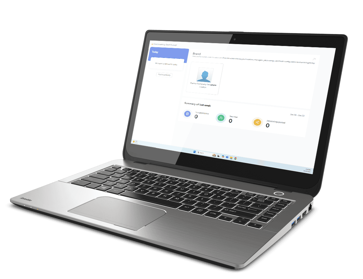
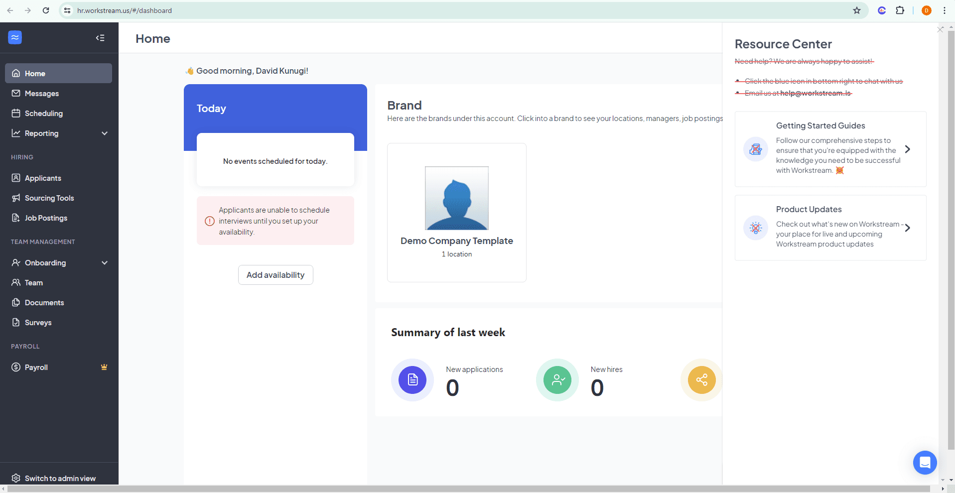
The problem: underutilized old homepage screen
THE CHALLENGE
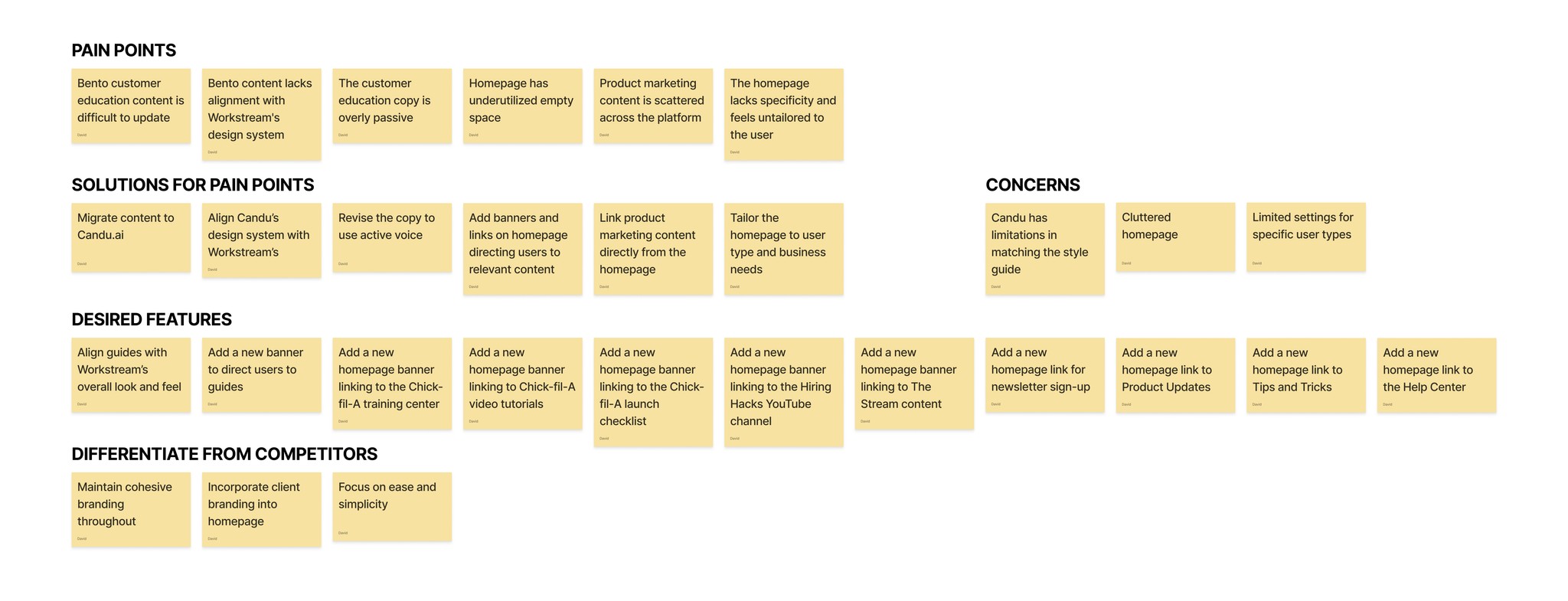
Our product marketing content—guides, education, upsell, and engagement materials—lacks seamless integration with Workstream products, which hampers customer conversion rates and drives up implementation costs.
There were two parts to my role. In part one, I managed the migration of product guides from Bento to Candu, ensuring they aligned with Workstream’s style guide and redesigning them as needed to fit seamlessly into the product UI. I conducted an audit of guide content, developing a formatting system with reusable patterns. In part two, I redesigned the homepage to improve accesibility to product marketing content.
KICKOFF
Workstream offers a wealth of content to its users; however, it is scattered throughout the software in a disorganized manner and lacks alignment with the overall design system.
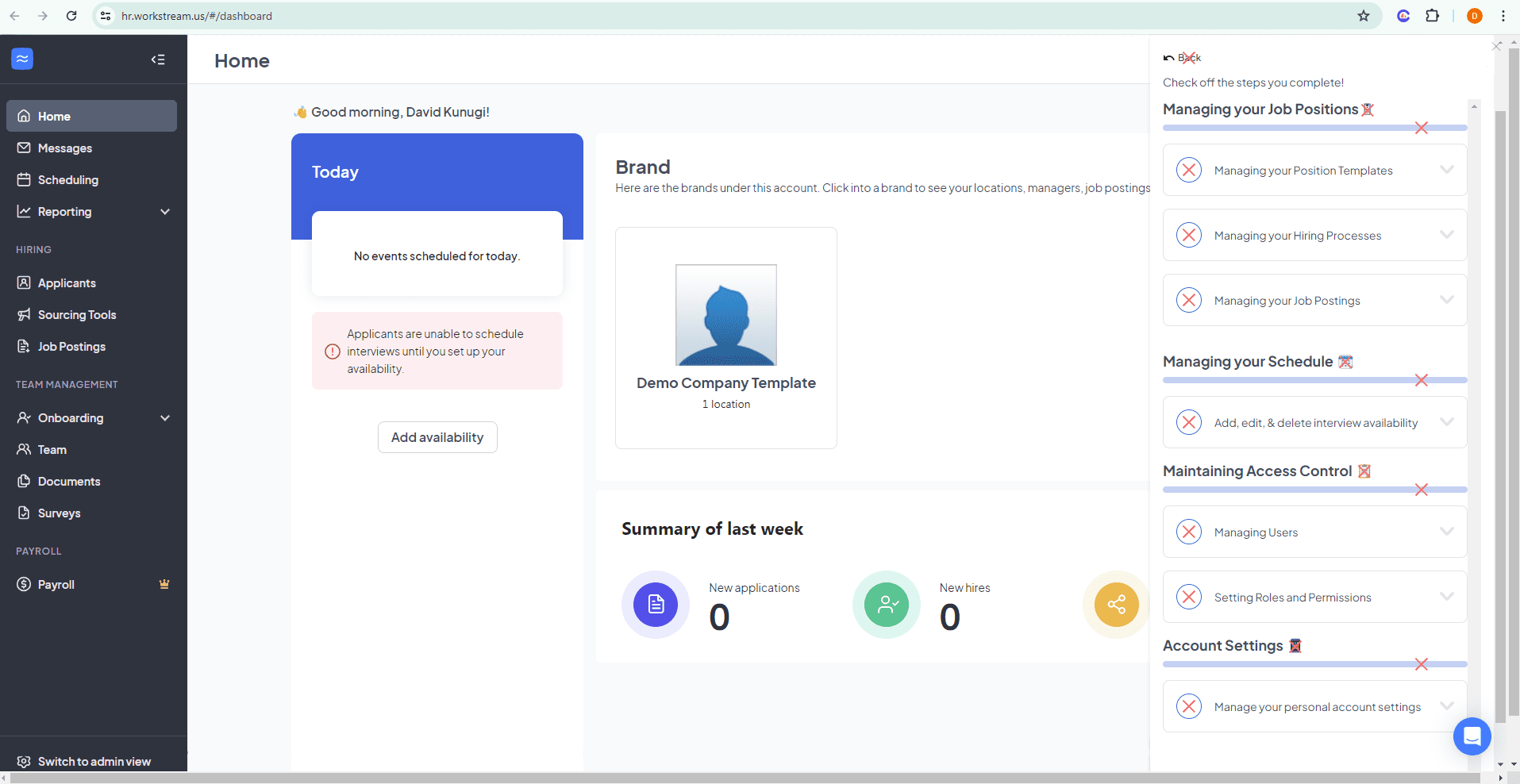
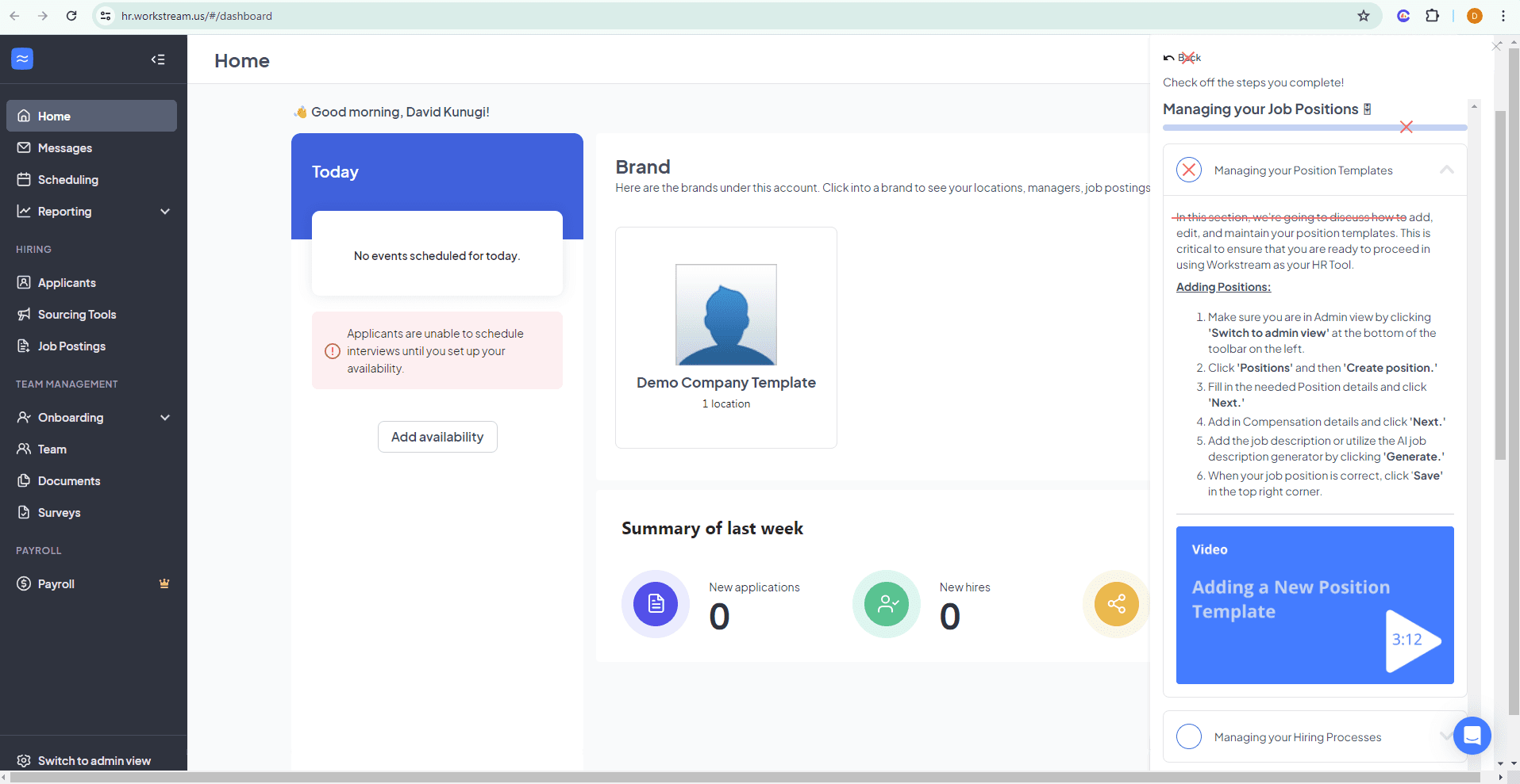
For part one, the goal was to improve the customer education guides- previously made in Bento- and to convert them using Candu.ai. Several areas of improvement were noted:
Match Workstream's design system to Candu's style guide
Improve visuals in guides and remove an extraneous UI elements
Make copy more concise and improve active voice
Design a cohesive banner to take users from their homepage to customer education guide content
For part two, the goal was to maximize the use of the homepage which is currently underutilized:
Improve exposure and visibility on new product updates
Improve discoverability around new products, target natural moments
Sign up for marketing content
Link to existing large library of content
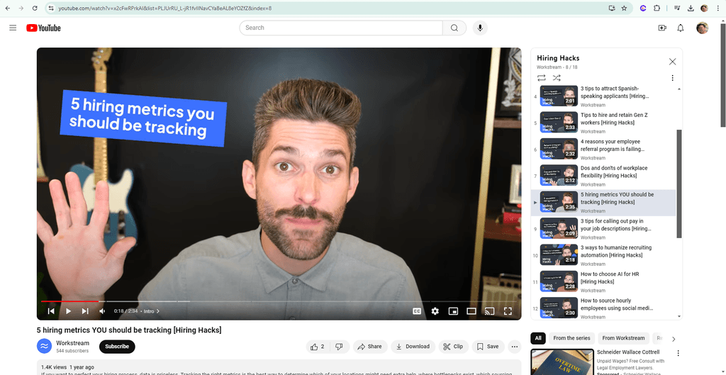
Short form videos of 2-3 minutes called Hiring Hacks
Longer form videos of 20-30 minutes for podcasts and webinars
KEY TAKEAWAYS
The first part focused on customer education and migrating guide content from Bento to Candu.ai. This includes refining the copy to be more concise, using active voice to guide users clearly on tasks essential for setting up Workstream accounts and kickstarting their hiring processes. Workstream's guides target three distinct user types:
General Managers: Responsible for setting up interview schedules, reviewing applicants, and maintaining communication.
Onboarding Admins: Tasked with configuring onboarding settings and processes.
Super Admins: Oversee multiple branches, manage hiring workflows, and maintain access controls for general managers and onboarding admins.
While all guide content and links to tutorials exist within Workstream, there's a lack of clear pathways to direct each user type to their essential onboarding resources.
The second part of this role involved integrating Workstream's existing product marketing content into the homepage to improve accessibility and boost conversion metrics. This included linking to:
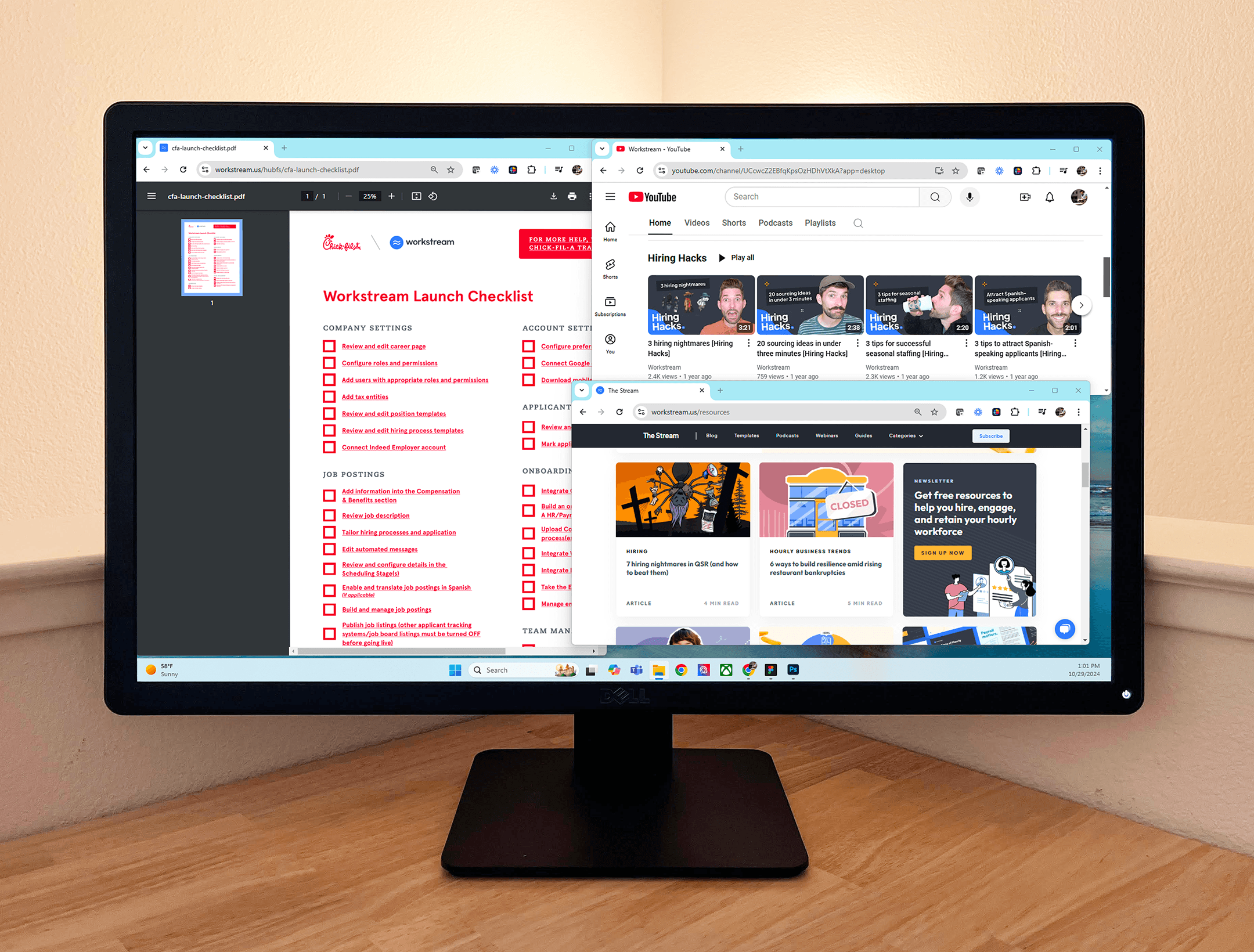
YouTube Hiring Hacks videos
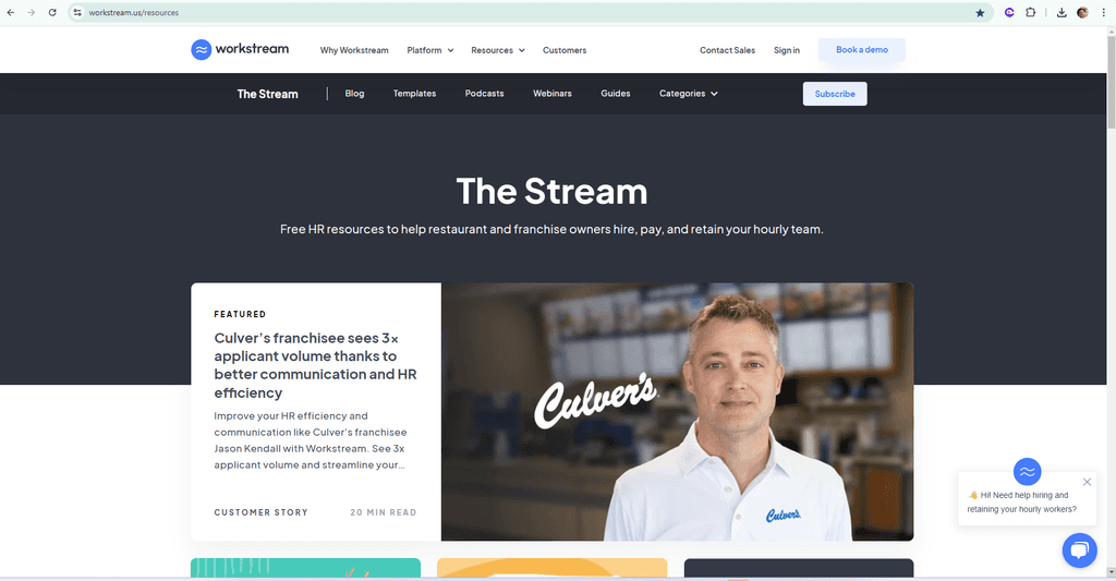
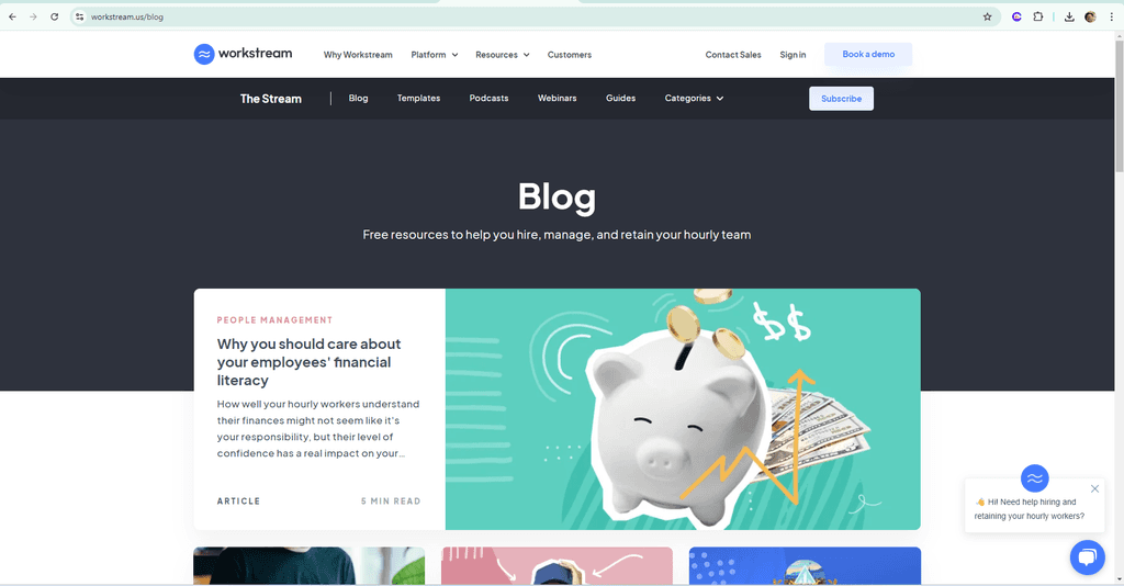
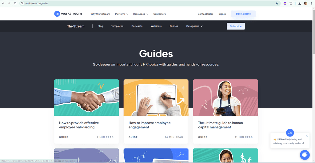
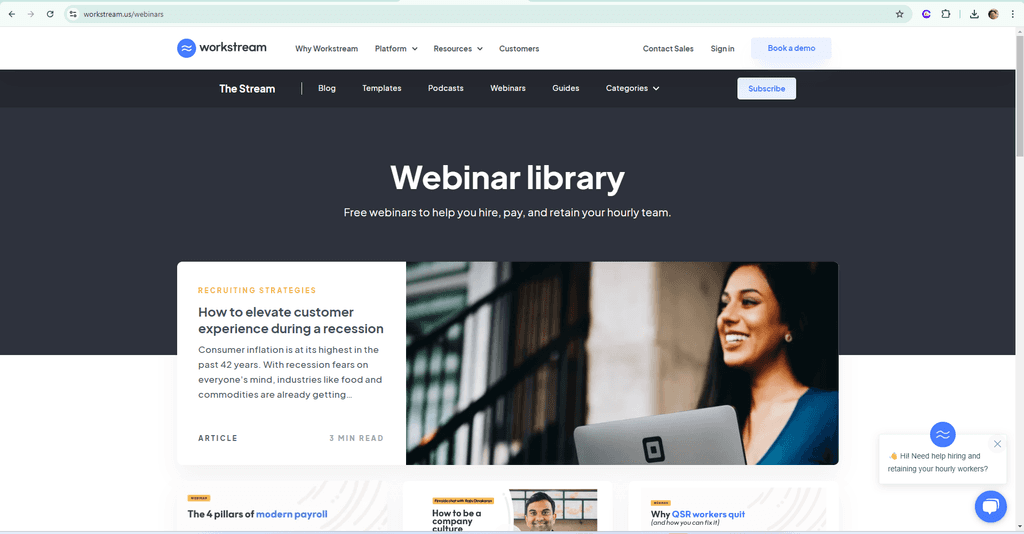
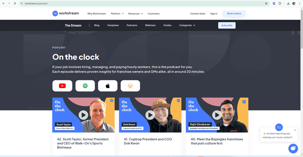
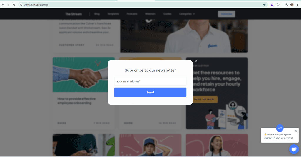
The Stream content, covering blog posts, podcasts, guides, and webinars
Monthly email sign-up option for resource updates
Specialized resources for high-priority clients, such as detailed launch checklists, in-depth tutorials, and a training center
The homepage user types were segmented into two main categories:
General Users
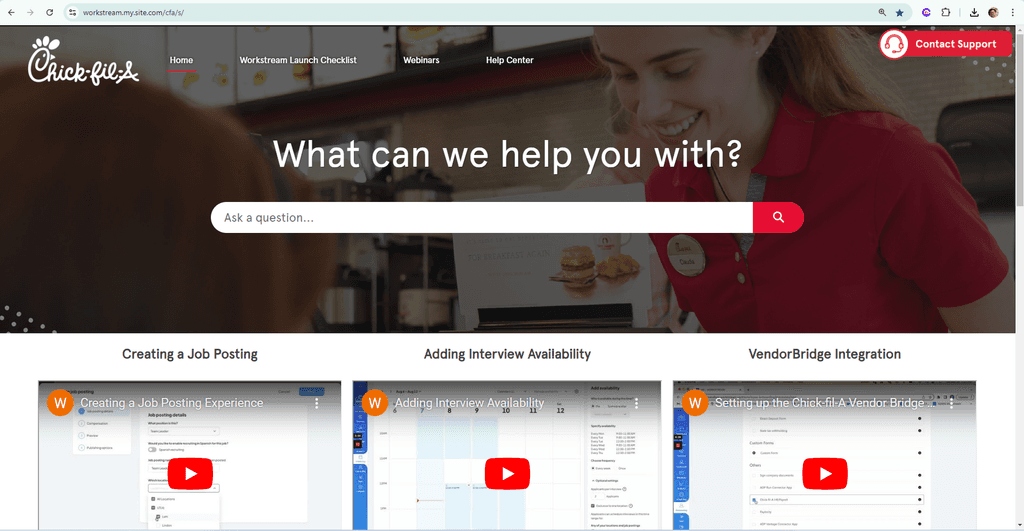
Specialized Clients (e.g., Chick-fil-A), requiring more tailored content
First part
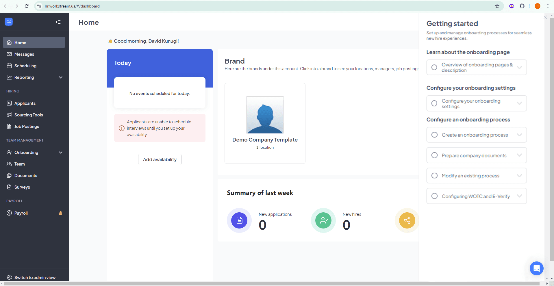
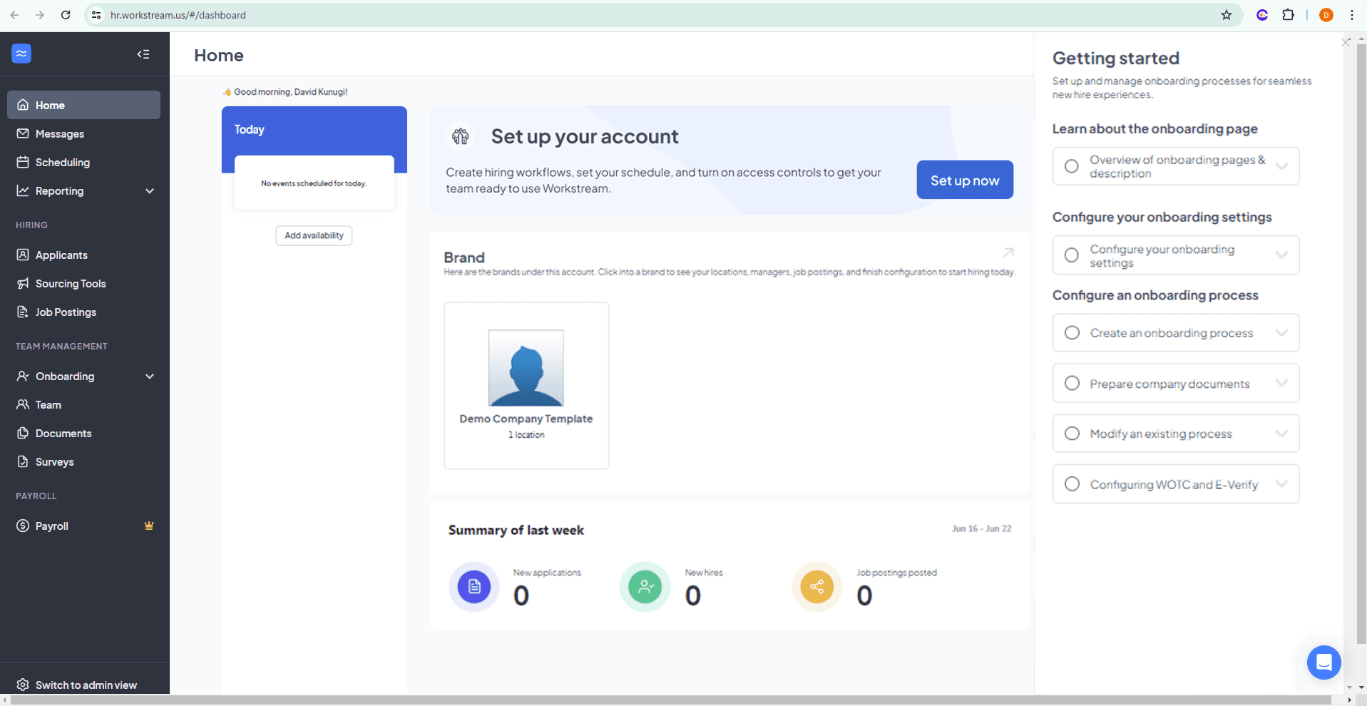
After migrating content from Bento to Candu, it became clear that adjustments to the style guide were necessary to better align with Workstream's design system.
Remove instructional text that should be intuitive and eliminate visual clutter.
Use icons from Workstream's design system library, remove status bars and unnecessary icons, and reduce the size of the interactive circle buttons.
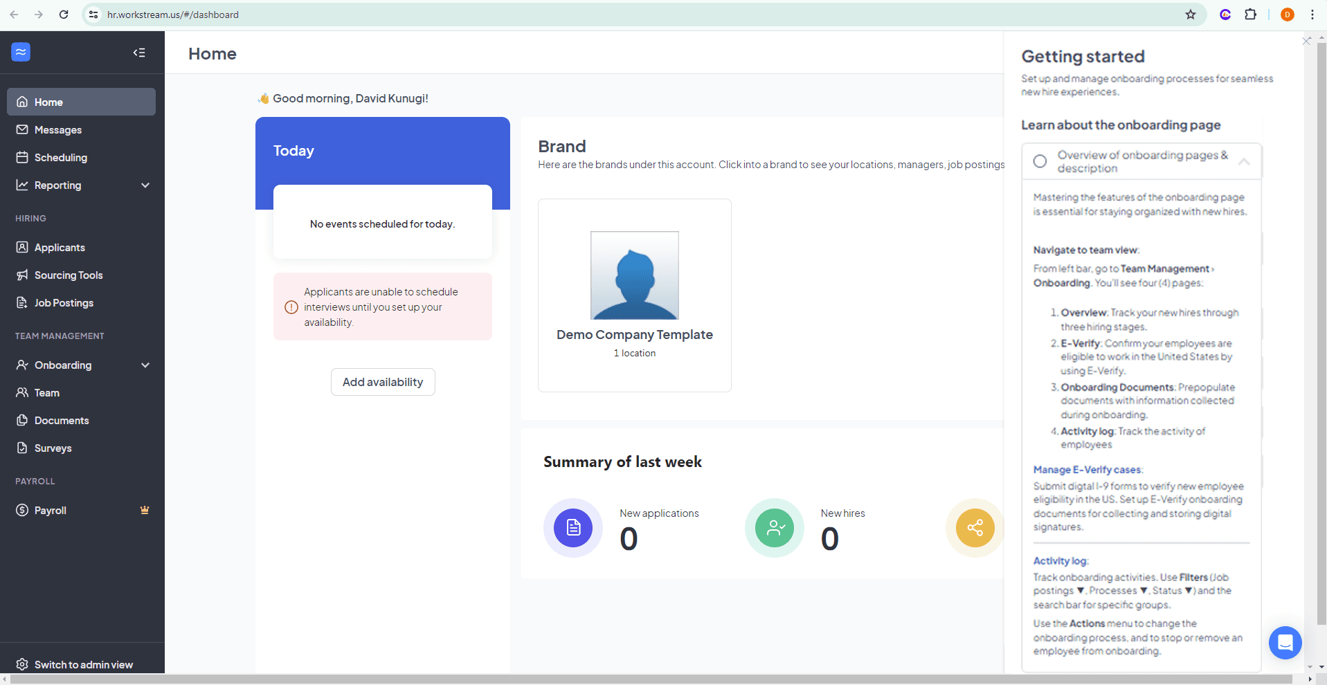
Use concise, active voice in the copy.
A cleaner interface that matches Workstream's design system with less visual clutter
Copy conveys value and uses active voice
First part
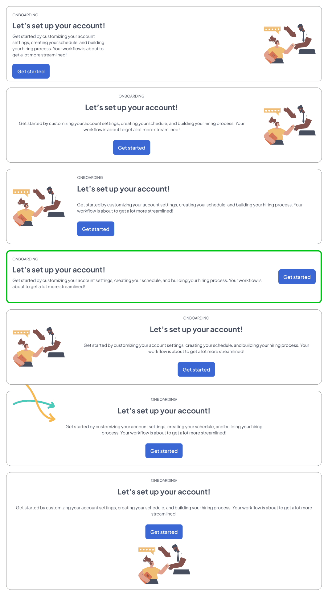
Once the visual styling and copy were adjusted, we needed a way to prompt users to access onboarding content from the homepage. This needed to come in the form of a banner that would feel like a natural, well integrated addition to the homepage.
PERMUTATIONS
The layout highlighted in green was selected due to effective use of screen space and intuitive left to right flow with the call to action on the far right.
BANNER BACKGROUND
Two background types pulling from Workstream's design library were considered. Light blue and dark gray. After testing both colors as banners within the homepage, it was apparent that dark gray was too visually heavy and called a little bit too much attention. Light blue was selected as it offered enough visual interest without calling too much attention to itself within the overall context of the homepage.
Final banner
Banner within context of homepage
SECOND PART
In the second part of this role, I tackled the challenge of addressing how Workstream's product marketing content is dispersed throughout the software. To improve accessibility and engagement, I focused on redesigning the homepage to create clear pathways that connect users to this valuable content.
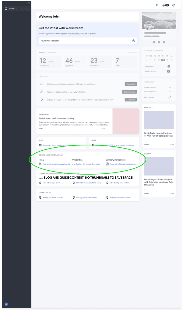
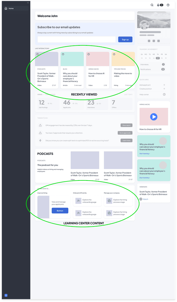
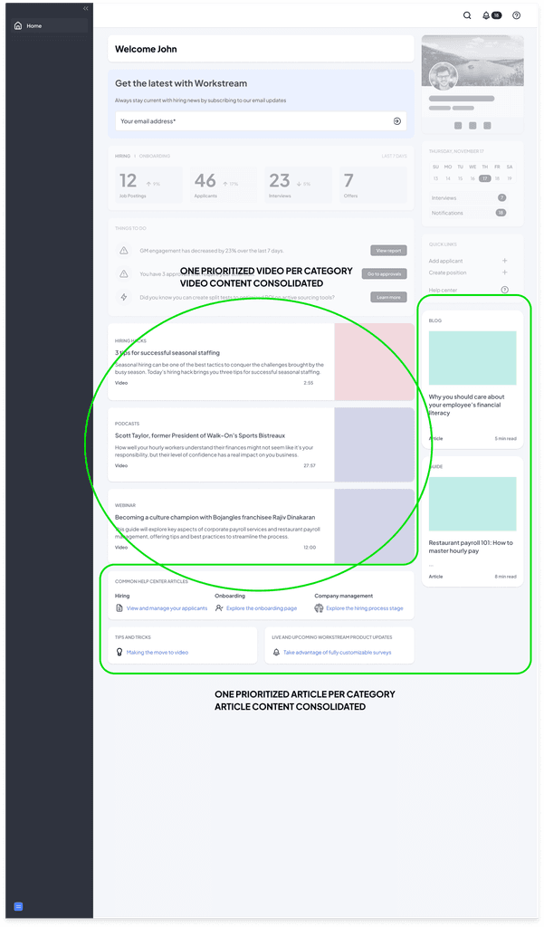
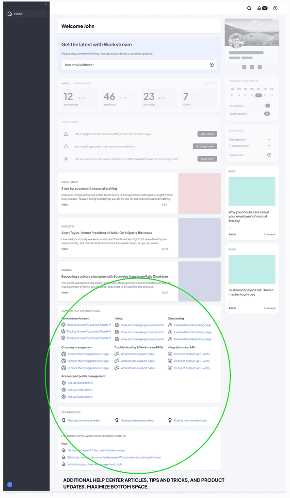
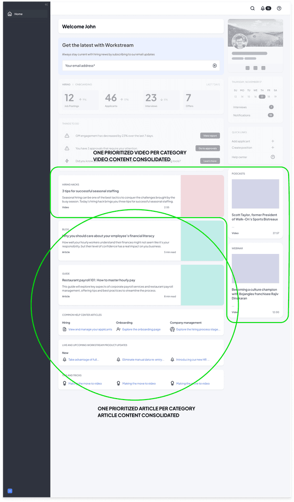
While Workstream offers a wealth of resources to help users optimize their use of the software and manage hourly employees effectively, much of this content is underutilized due to its scattered placement and lack of visibility. Below are the diverse content types Workstream provides—resources that could significantly enhance user performance if made more accessible and easier to navigate.
After analyzing the problem and evaluating the previous homepage, this general layout was used as the foundation for the homepage redesign:
SECOND PART
CARD CREATION
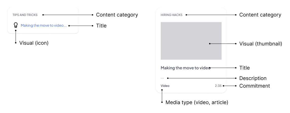
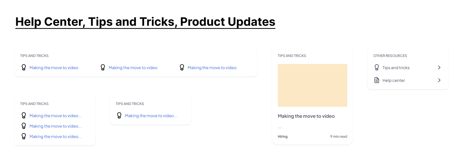
To kick off the homepage redesign process, I began by developing a component system that could accommodate various content types—such as blog posts and video media—while ensuring a consistent and cohesive structure throughout.
CARD PERMUTATIONS
Next, I applied the card components to showcase the various content types we wanted to connect users with. I experimented with layouts featuring individual cards as well as cards displaying multiple pieces of content simultaneously.
Additionally, I designed a banner with a clear call-to-action, encouraging users to sign up for the newsletter to receive email updates.
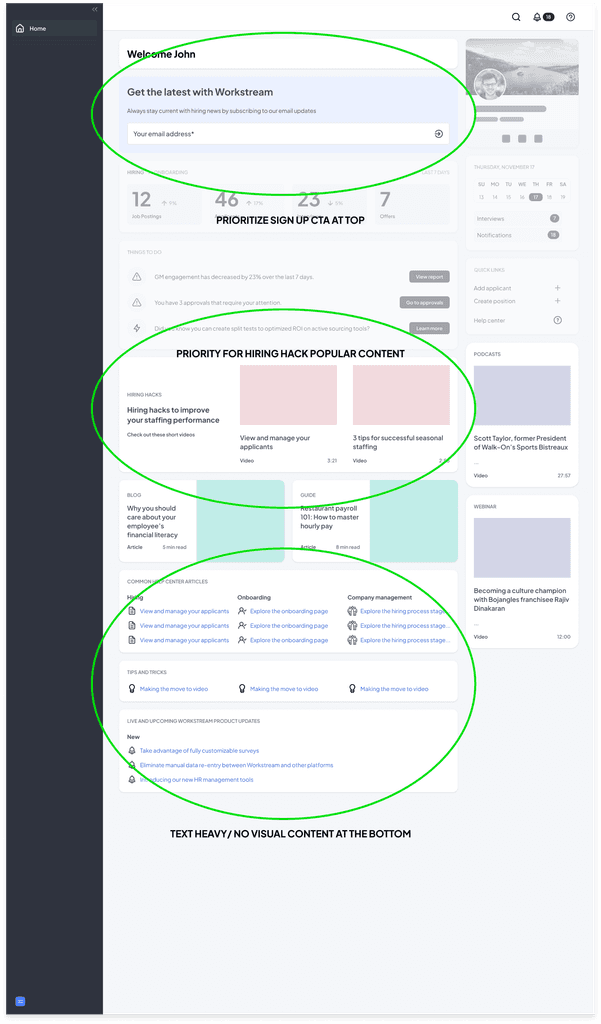
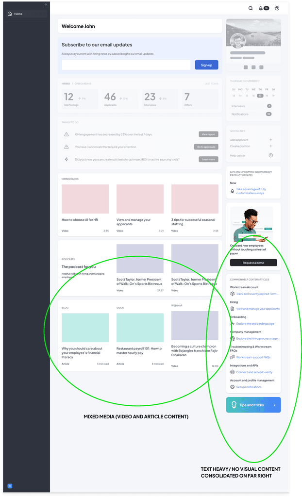
INITIAL HOMEPAGE COMPOSITION STUDIES
THE TAKEAWAY- TOO BUSY!
The key takeaway was that the content needed to be streamlined—less is more. This meant focusing on concise, impactful messaging and considering banner forms to consolidate information effectively. The next step involved conducting a competitive analysis to explore how other banners are designed to convey value, relevance, and forgiveness, providing insights for improvement.
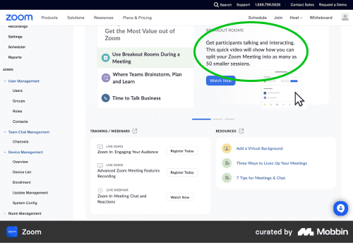
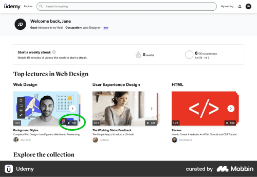
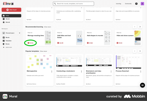
COMPETITIVE ANALYSIS
SECOND PART
After conducting a competitive analysis of banners used by different companies, I explored various banner options to effectively link users to our Hiring Hack content and The Stream content. For The Stream banner, I streamlined the design by integrating the newsletter signup directly into the banner, creating a unified and efficient user experience.
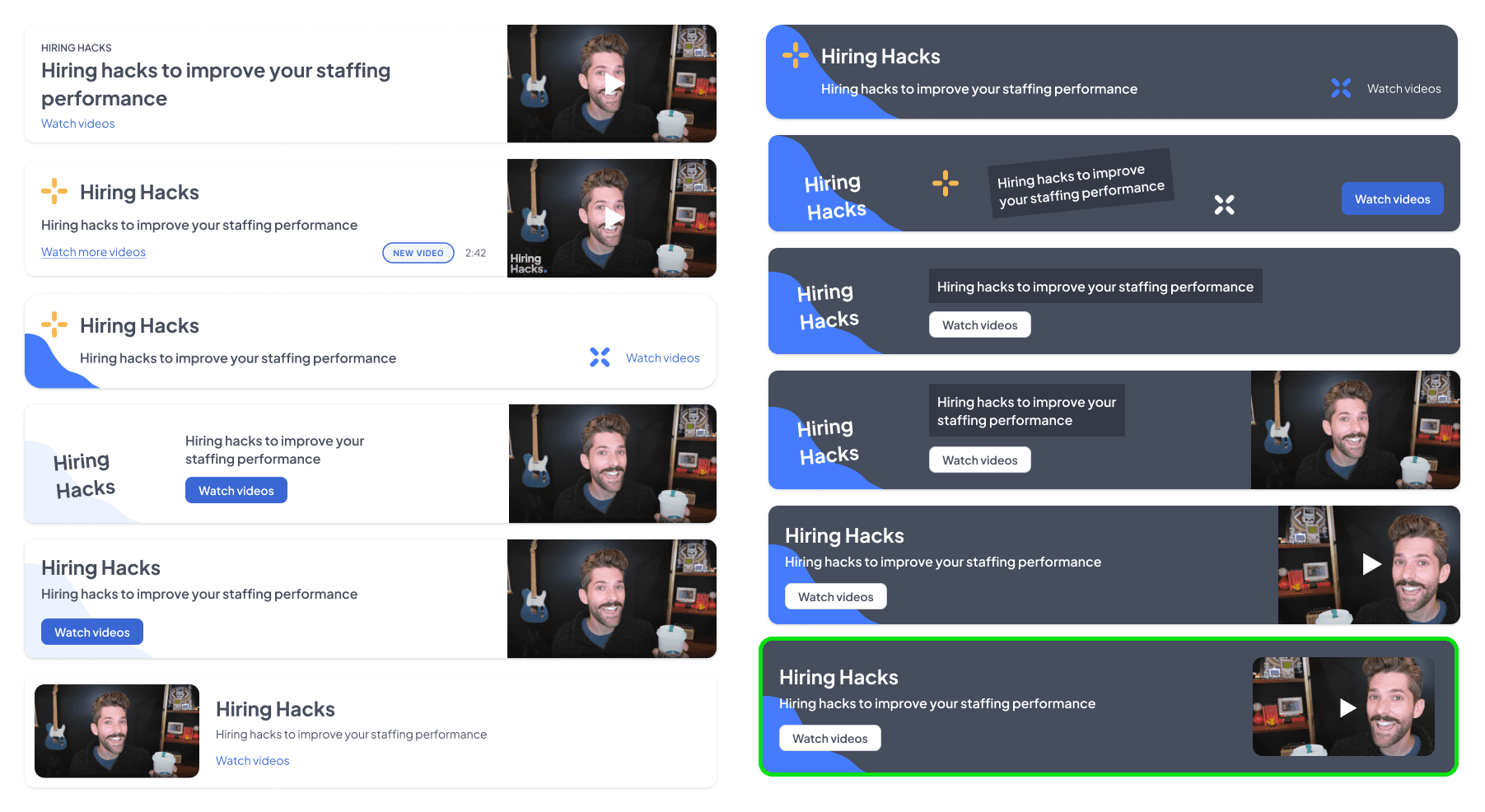
HIRING HACK BANNER
Drawing from the existing graphic language of the Hiring Hack channel, I created a series of permutations for the Hiring Hack banner. After team discussions, we decided to eliminate the use of colored crosses, as they closely resembled Walmart's branding. Additionally, it was agreed that a white banner lacked sufficient visual impact. After further consideration, the team reached a consensus and selected the bottom-right banner as the final choice.
Banner example from the Hiring Hack channel
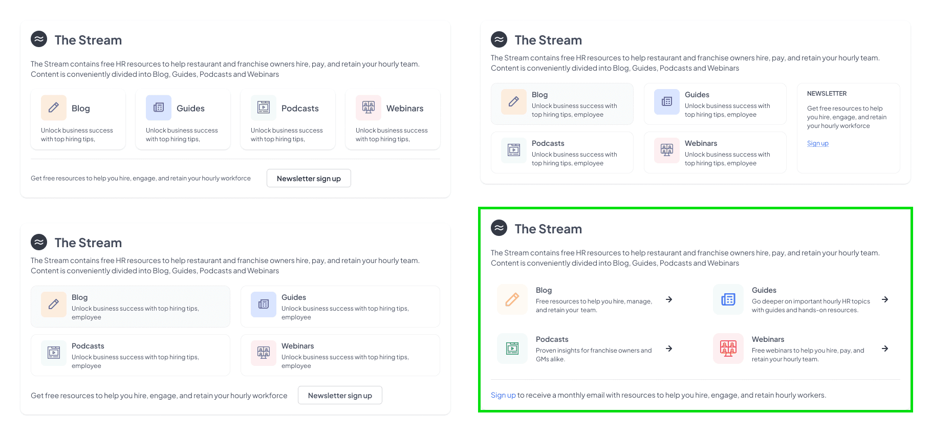
THE STREAM BANNER
I created numerous permutations to explore how to consolidate The Stream content with a clear call-to-action for signing up for the Workstream newsletter. After team discussions, we agreed that the second option in the first row showed the most potential and was worth further exploration.
The colors for the banner were drawn directly from The Stream page to ensure visual consistency. After extensive consideration and discussion, the team decided to proceed with the fourth option. Its simplicity stood out, as it eliminated the need to display card outlines for each of the four categories, creating a cleaner and more streamlined design.
SECOND PART
After completing the banner studies for general homepage content, including Hiring Hacks and The Stream, I shifted focus to incorporating specialized client content into the general homepage.
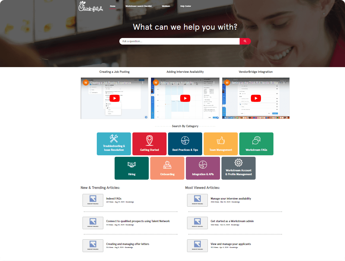
Below is an example of the Chick-fil-A content that requires linking. All of this information is currently hosted on the Chick-fil-A microsite homepage of Workstream:
For our Chick-fil-A client, we aimed to provide clear and direct access to the following key resources:
Chick-fil-A Microsite
Chick-fil-A Launch Checklist
Chick-fil-A Trending Videos
This ensures that their specific content is easily accessible and tailored to their needs.
INCORPORATING chick-fil-a branding
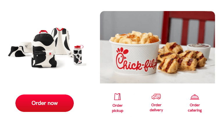
Incorporating visuals that aligned closely with Chick-fil-A's branding was a top priority. Our goal was to ensure that when the client logged into their Workstream homepage, it felt like a seamless and natural extension of their company’s journey, reinforcing brand consistency and familiarity.
Chic-fil-A branding examples
BANNER STUDIES FOR CHICK-FIL-A MICROSITE
BANNER STUDIES FOR LAUNCH CHECKLIST
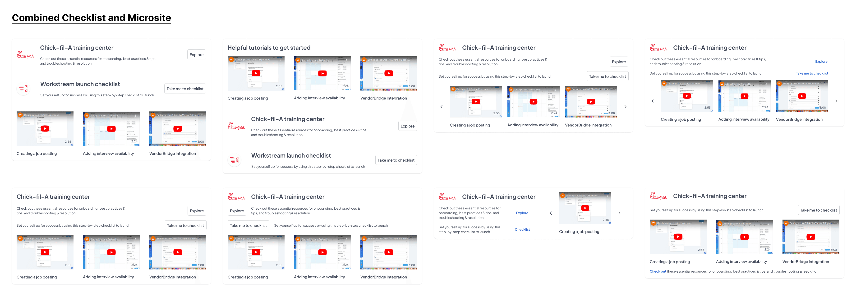
COMBINED LAUNCH CHECKLIST, MICROSITE CONTENT AND TRENDING VIDEOS
second part
HIRING HACK BANNER
The Hiring Hack banner was nearly complete. The final adjustment involved swapping the video thumbnail with a new one that reinforces the blue swirl visual, ensuring consistency with the overall design theme.
tHE sTREAM BANNER
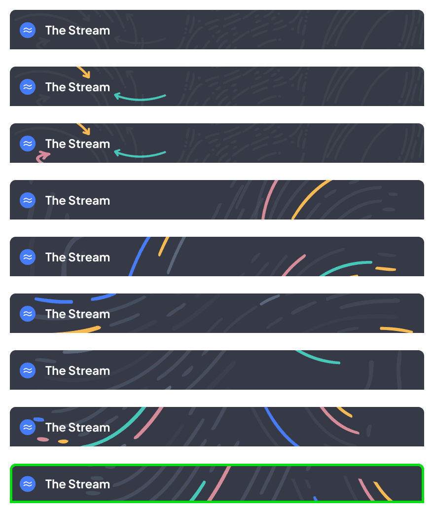
Once we finalized the overall layout of The Stream banner, the next step was enhancing the header with more visual interest. To achieve this, we drew inspiration from the existing visual language on The Stream page, ensuring a cohesive and engaging design.
Inspiration visual language found on the The Stream page
Banner consideration
After some consideration with the team, we agreed that the above banner design fell flat and could be further enhanced. Pulling from Workstream's visual library, this graphic served as a template for further banner studies:

After a team voting process, the last banner option emerged as the most popular choice. This design resonated strongly with the group, aligning with the desired visual balance.
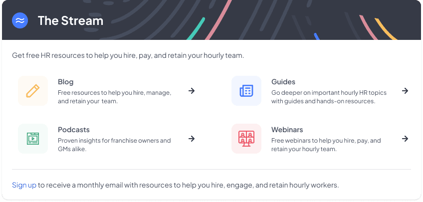
final "the stream" banner
chick-fil-a BANNER
Drawing inspiration from Chick-fil-A's branding, I explored various ways to incorporate their color schemes, patterns, and logos. During this process, red was deemed too overpowering, while the solid dark gray banner felt excessively heavy. To address these concerns, I experimented with a dot pattern to create a lighter appearance. However, the cow pattern resonated strongly with the team, capturing the essence of Chick-fil-A's identity, and was ultimately selected.
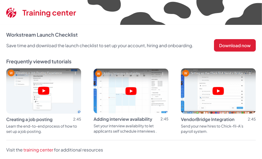
FINAL CHICK-FIL-A BANNER
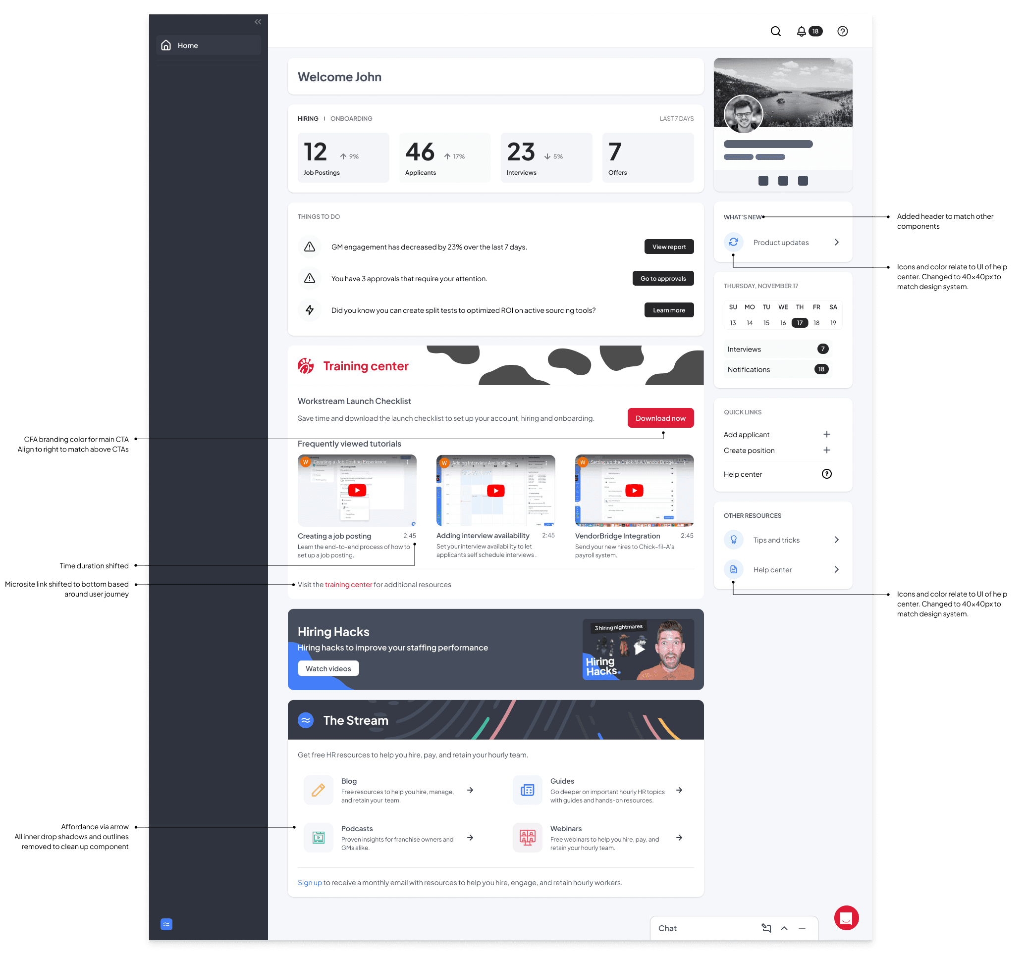
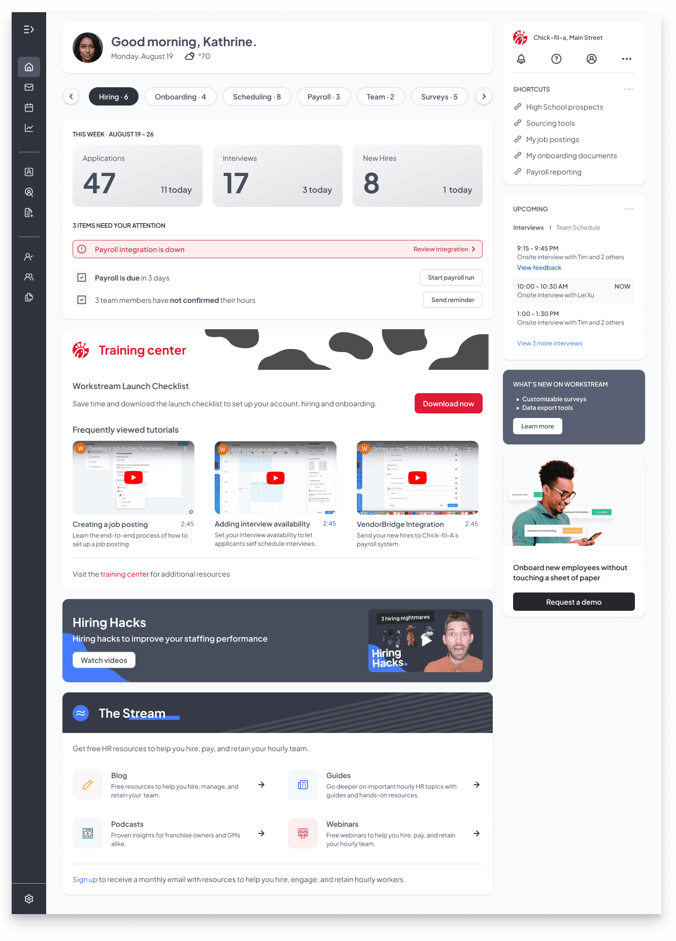
the final design
The homepage design fully came together once the banner designs were finalized, providing a cohesive and visually engaging experience that effectively connected users to the content.
FINAL THOUGHTS
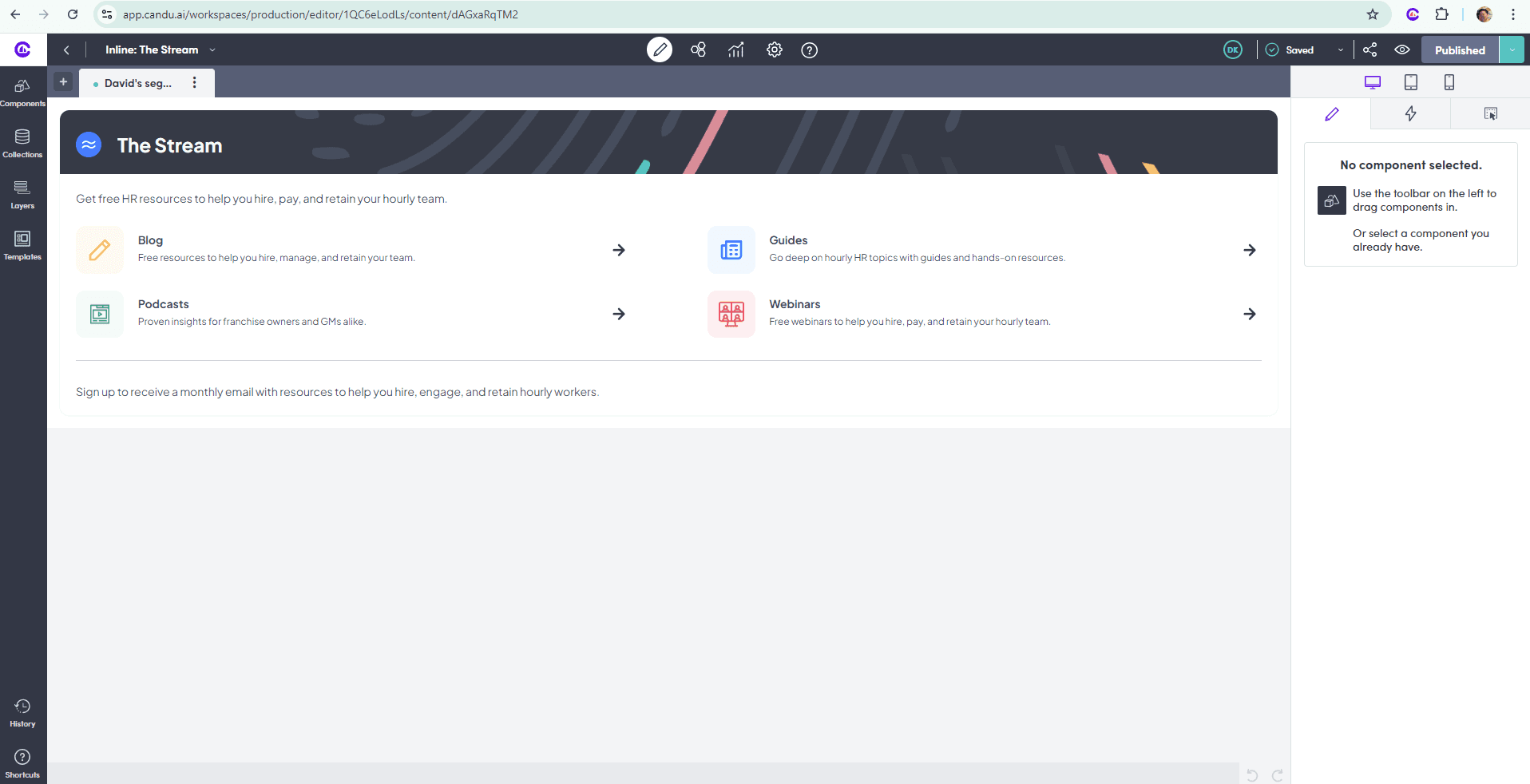
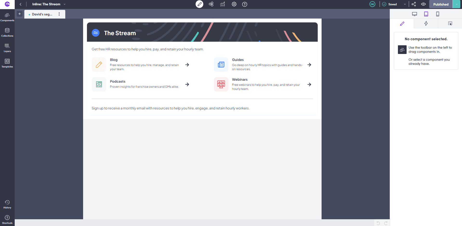
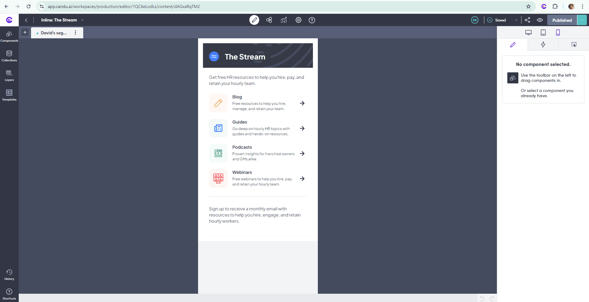
The final step involved translating the banner designs into Candu.ai and ensuring they were optimized for responsiveness. This process included adapting the designs to perform seamlessly across various devices and screen sizes, maintaining both visual integrity and usability.
Web browser
Tablet
Mobile
FUTURE HOMEPAGE
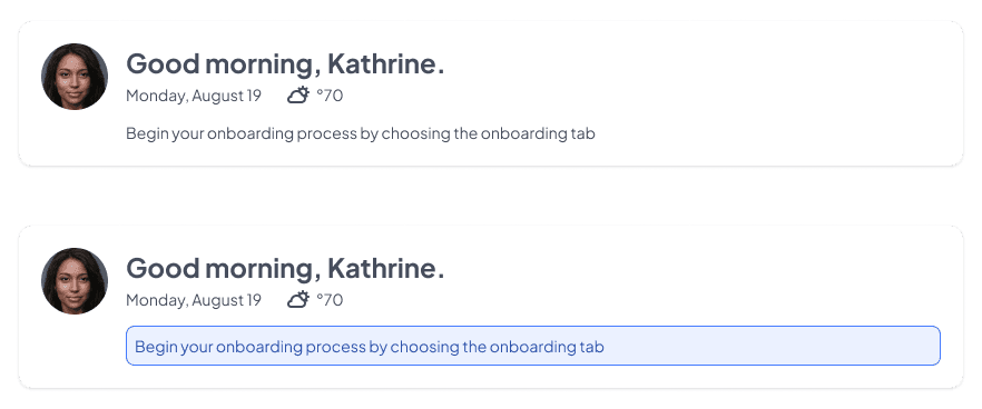
Workstream is planning to enhance the homepage by introducing a tabbed navigation feature that highlights the core functionalities of their product: Hiring, Onboarding, Scheduling, Payroll, and Surveys. As part of this update, it's crucial to refine the homepage content I developed to seamlessly integrate with the new layout. Additionally, ensuring users can easily navigate to essential tasks within each product feature will be a top priority. To support this, incorporating guides into the top header could help users quickly access key tasks and prevent them from being overlooked.
Future tabbed navigation feature at top of homepage
Potential way to guide users to essential tasks

